Good logo designs are a lot more than just pictures.
Your logo design is your brand ambassador, a visual representation of your company which needs to be readily identifiable in the marketplace. So, it’s vitally important to have a skillfully designed logo which will continue to represent the essence of your brand, and the nature and uniqueness of your business.
As your logo design is an immediate and honest impression of your business philosophy, conveying why your brand is special, it is essential that it stays up-to-date and continues to represent your brand even as times change.
People make snap judgments in a hurry. So, your logo needs to connect with them emotionally and catch their attention by showing off your brand personality through its colours, fonts, and overall design.
Logo Refresh vs Redesign vs Rebrand
Refreshing a logo design can help breathe life into a brand but doesn’t change its fundamental identity; instead, it preserves its integrity while making it more relevant to the times.
Minor tweaks can include slight revisions to font, colour, sizing, or even subtle elements, but fundamentally retaining its essence. Large companies, such as Qantas, Apple, Coca Cola and Pepsi Co, have been masters at logos tweaks over the years, often unbeknownst to the consumer.
Unlike refreshing or minor tweaks to a logo and other visuals, though some use the two interchangeably, they don’t refer to the same thing. A rebrand is a much deeper revamp. It involves changes to the overall marketing strategy, brand story, and even target audience. Think of a rebrand as major plastic surgery, and redesign as a makeover.
Thinking of doing a rebrand? Get an idea about the process here.
Here are some things to help you get started on designing your logo
1. Know Thy Brand.
As a business owner, you must know your brand inside out.
Delve deeper into what sets you apart by asking yourself these questions —
- What is my brand identity?
- What makes it unique?
- What do we do better than anyone else?
- What three words describe my brand?
- How do I want people to see it?
Do not be afraid to see where these answers take you. Part of discovering your brand identity is finding the elusive “vibe” you want to evoke in your customers when they see your logo design.
Do you want to be seen as fun? Trustworthy? Modern? Serious? Logo designs complement the brands they’re associated with. Don’t be afraid to pursue something unusual. The better able you are to reflect your brand personality through your logo, the more it will show your character, and the better your customers will remember you.
2. Keep It Clean and Simple.
As a design principle, “keep it simple, stupid” has been around for ages, and is an important edict to remember when it comes to designing – well, everything.
The best logo designs are simple and uncluttered. Not only will they stand out more, but they will be more easily recognizable, and more effective in communicating your message. You only have a second or two to catch people’s attention, so a complex design will be too hard for them to take in. And most will not even bother to try.
When your logo designs are simple, they are memorable and easier to describe. Keep in mind, having a simple logo does not mean it must explicitly include what your business does. When your logo is too detailed, you end up blasting your potential customer with everything at once, and if it is too obvious, you leave them with little sense of wanting to discover more.
3. Hook Your Audience.
Remember: it is emotion that brings people in.
What emotions do you want your logo and brand to evoke in your customers? Do you want them to feel happy? Sentimental? Adventurous? This is another aspect where a deep understanding of your brand comes in. What is your brand at its heart? Focus on the benefits of your brand – the underlying need that your product fulfills in your customers. For example, BMW’s “Designed for driving pleasure” and Apple’s “Think Different.”
Make sure you know the demographics of your target audience. If you have a clear idea of their age, lifestyle and background, for example, it will be easier for you to make an emotional connection with them.
Your logo only attains meaning when it is clearly associated to your brand. Businesses are not known because of their logo designs, instead, the quality of their products, services, and customer experience bring prominence to the logos that complement them. A logo can never stand on its own, especially in the beginning. It needs to work hand-in-hand with your business values and philosophy.
4. Choose Your Design Style and Type.
Now that you know your brand, who your target audience is, and how to connect with them, it’s time to think about the design of your logo itself.
If you are visual like most people, one suggestion we’ve found helpful for newbies is making a mood board. Having one on Pinterest or creating one physically will provide you with a place to collect colours, combinations, graphics, text, even other logos that you’re drawn to, and which inspires you. Sooner or later, it will start reflecting the design style you’re leaning toward.
It can be overwhelming in the beginning but breaking down elements of your design will separate the task into more manageable pieces.
What look are you going for? Minimalist or retro? Modern or handmade? The aesthetics of your design style can be a combination of these and not just one. Don’t be afraid to mix and match.
Next, choose the type of logo design that fits your brand. A logotype? An emblem? A mascot? A monogram? Because there are many types, it’s best if you work with a design agency to see which best suits your brand.
We have created a stunning portfolio of logos for businesses like yours. Get inspired by some of them here.
5. Colour is Key.
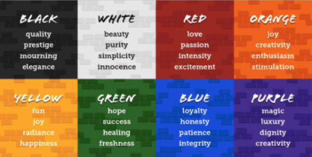
The psychology of colour is nuanced and complex, as each colour not only conveys individual meaning, but is also associated with distinct ideas.
Beyond aesthetics, choosing the right colour palette for your brand can directly communicate your brand identity, convey your values, and connect with your audience at a deeper level.
Working with a design agency can help you apply colour theory properly and figure out which colours work well together. Check out one of the articles we wrote on the psychology of colour to see which colour or colour combination complements your business and brand message.
If bright colours, black, and white seem too bold and brash for you, choosing a monochromatic palette in the colour of your choice can be a good alternative, and even provide depth and texture, relaying a subtler message.
Pro tip: Make sure your logo also looks good in black and white. Most people assume their logos will always be printed in colour, but that’s not always the case. It pays to be prepared.

6. Pick a Great Font.
There are five general font styles to choose from that can complete the look of your logo: SERIF, SANS SERIF, Script, Modern and Display fonts. Depending on the emotion you want to bring out, and the look you want to achieve, you can choose one of these, or even customize your own to differentiate you from all the rest.
The most important rule is that your font choice must be clear and legible. You don’t want any misunderstandings just because your customers could not read what you were trying to say! Creating a style guide that is specific to your brand can ensure cohesiveness of your brand message across your marketing collaterals.
7. Stand Out from the Crowd.
Don’t become a cliché. Even though checking out the competition is a great way to see what works and what does not, however, do not make the mistake of copying them. What works for their business may not work for yours; instead, observe what sets you apart and emphasize those differences. It’s quite the balancing act to stick to what works and yet change things up.
Pro tip: Avoid using clip art at all costs, it’s a surefire way of looking tawdry and second-rate.
No matter how big or small your business may be, your logo creates the first impression of your brand. It will be visible on all marketing collaterals and promotional channels, especially as you build up your reputation and brand recognition. Your logo must look good big or small, near or at a distance. Make it scalable, so it preserves its integrity wherever it may be placed.
It is not easy creating a logo design that is simple, easily recognizable yet distinguishable, and is uniquely you. As some of you who have tried to create your own logo know by now, designing a good logo is not for the faint of heart, and it can quickly become overwhelming. It is always a good idea to consider hiring a design agency to help you. Since your logo design goes a long way toward influencing public perception, it may be one of the best investments you have ever made. Remember that amid all the visual clutter in this world, you only have a few seconds to influence customer decisions. Make it count.
Content Box specialises in clever design solutions for company logos, content, digital marketing and promotions collateral. If you need a good source of inspiration, check out our design portfolio here!
