In today’s digital age, graphic design plays a significant role in creating a visual impact on consumers. It can make or break a brand’s reputation in seconds. Graphic design mistakes can not only be embarrassing but can also be costly for businesses.
Over designing something can be easy to do, especially if you are working with a business owner who has lots of ideas and enthusiasm. As a provider of graphic design services, it is our job to ensure that the concept(s) and essence of a design is created and conveyed through carefully balanced design elements.
In this article, we will take a look at 7 epic graphic design fails that can easily be avoided.
1. Poor Font Choice
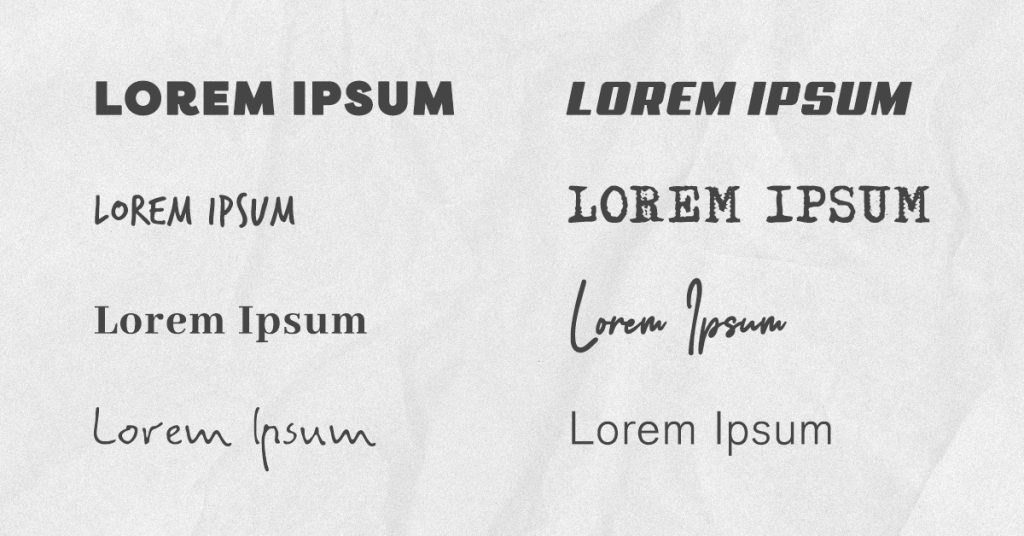
One of the biggest mistakes we see in graphic design is incorrect font choice. Fonts are not just letters; they are an essential part of a brand’s visual identity.
Choosing the wrong font can make your design look unprofessional, confusing, and difficult to read. A font needs to be legible and complement the brand’s image and message.
You might also want to consider how and where you will use the font e.g., in print, on social on a website, as some website designers only work with Google fonts.
Using a font that isn’t compatible across all mediums will compromise your branding and ultimately your businesses image.
2. Don’t Overuse Graphics
Graphics are a crucial part of graphic design but overusing them can lead to cluttered and confusing designs.
A good designer knows when to use graphics and when to let negative space and simplicity speak for itself.
I often see pieces that have been over designed. Too many stars, smiley faces, too much text or too much patterning are just some of the mistakes.
When briefing your designer, be sure to give them all your ideas, but don’t be upset if they choose not to use all the elements you have suggested.
Often in design, less is more, so make sure to use graphics sparingly and purposefully.
3. Choose Your Colours Carefully
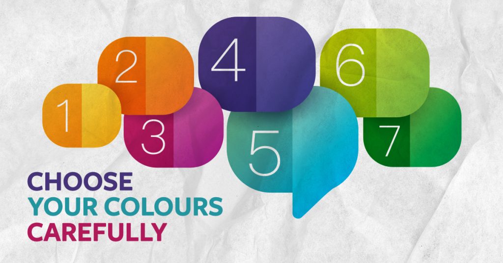
Colours can evoke a strong emotional response from the brain, therefor choosing the right colour palette is essential.
Poor choice of colours can result in a failure to convey a message, or the wrong message being communicated. The wrong colour can also result in a design that is unappealing and ineffective.
Before selecting colors, it is important to consider the brand’s personality, target audience, and industry.
Make sure to choose colors that complement each other and work well together. For example, financial services sectors ten to use ‘safe’ colours such as blues and teals. Those in the environmental sector tend to sway to the green and blue palette, to represent crispness, life and energy.
Conversely, reds, pinks and purples invoke a feeling of fun, risk and magical creativity, something that wouldn’t work well for an investment banking business, that relies on building trust and confidence.
So, the long and short of it, choose and use colour wisely, and trust your designer or account manager to give you the right advice from the start.
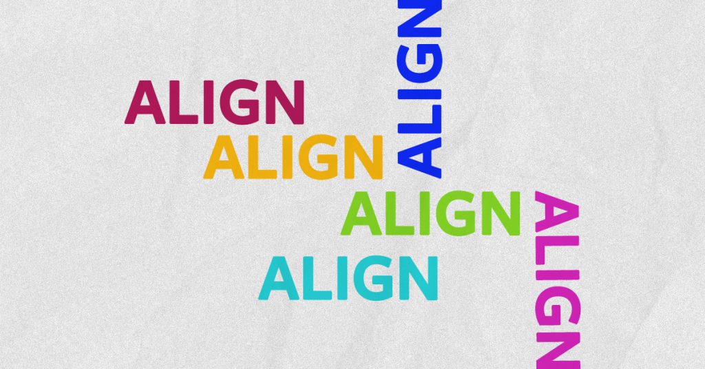
4. Align, Align, Align!
Alignment is a fundamental design principle that is often overlooked and misunderstood.
You might look at something and thing, ‘gee that doesn’t look quite right’, but not really know why. Often this can be where alignment comes into play.
A design that is improperly aligned can appear disorganized, messy, and unprofessional.
Alignment works to create a cohesive structure that arranges and organises elements into a visually appealing design.
Keep this in mind when adding in extra elements or requesting changes, as a good designer, should be presenting designs that are well aligned and balanced.
5. Inconsistency
This is something I see fairly often and commonly in DIY designs, designs coming from cheap online platforms or in businesses where they use multiple design suppliers.
There is a difference between being a fully trained graphic/visual designer with a solid understanding of human psychology and marketing and being able to use design software. The net result is inconsistency in design which can create confusion and mistrust in the brand.
Consistency is critical in graphic design.
Making sure that all elements, including fonts, colors, and graphics, are consistent throughout all designs will create a cohesive and professional look that will resonate with the target audience and instill a perceived higher value in the business.
6. Low-Resolution and Wrongly Sized Images
It goes without saying that people don’t want to look at a something that looks like a fuzzy TV set, not do they want to look at something that has half an element cut off as it wasn’t sized correctly.
These days with smart phones, there is no reason to use an image that is pixelated or blurry.
Make sure to use high-quality images that are properly scaled and optimized for web or print use. This will ensure that your design looks crisp and professional.
And don’t forget to resize them for the platform you are using them on. Instagram uses square orientation whereas Facebook and LinkedIn use rectangular orientation, so the same image cannot be used on the same platform. It needs to be resized to match where it will be used.

7. Poor Hierarchy
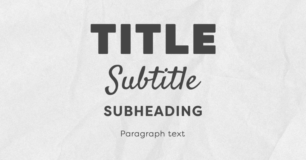
Hierarchy is the arrangement of design elements in a way that creates a clear visual flow that encourages the eye to track a certain way across well sequenced information.
Without well-structured hierarchy, a design can be confusing and difficult to understand.
To establish clear hierarchy, well sequenced visual cues as size, color, and placement are critical. Having this done correctly will create a clear and easy-to-follow visual flow for your reader and will create a higher level of engagement with your brand.
In summary, graphic design is an essential aspect of a brand’s visual identity, personality, and message.
It is important to be aware of these 7 epic graphic designs fails, so that all your designed pieces work like masterpieces that are stunning and effective and bring an increase in perceived brand value for your business.
Quick Reference Guide
- What is the importance of proper alignment in graphic design?
Proper alignment ensures that a design appears organized and professional. - Why is consistency important in graphic design?
Consistency creates a cohesive and professional look that resonates with the target audience. - What is hierarchy in graphic design?
Hierarchy is the arrangement of design elements in a way that creates a clear visual flow. - Why is it important to choose the right font in graphic design?
Choosing the right font ensures that the design is legible and complements the brand’s image and message. - What’s the best way to choose a color palette for my design?
Consider the brand’s personality, industry, and target audience. Choose colors that complement each other and convey the message you want to send.
